Colour 101: understanding how colours impact apparel design
Colours play a vital role in design and everyday life. They can draw your eye to an image, evoke a certain mood or emotion, even communicate something important without using any words. It is also the most important element of appearance as it’s the first thing anyone pays attention to. It can make you stand out and look absolutely awesome, or it can completely ruin the impression. So, how do we know which colours look good together and which don’t?
The answer is simple – colour theory! Artists and designers have followed colour theory for centuries. It can help you feel confident in different situations, whether it’s choosing colours for design purposes or putting together the perfect apparel collection or just jazzing up your wardrobe a bit. With a little insight, you’ll be looking at colour in a whole new way.
Colour 101
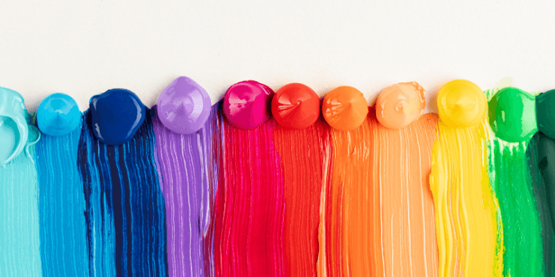
First, let’s start with a look at the basics of colours. There are two main categories for how colours can work together; these are primary and secondary. Primary colours are red, blue, and yellow. Secondary colours are the colours in between the primary colours – orange, green, and purple. If we mix primary colours with secondary colours, we get more shades between yellow, red, orange, green, and so on.
Altogether, they form what is called a wheel of colour. If we go one step further, we start to look at hue saturation and value. These terms will help you understand more nuanced colours like the little paint chips you can find at a home improvement store. Hue is basically another word for colour or shade, while saturation refers to the intensity or, in other words, whether the colours appear more subtle or more vibrant. Highly saturated colours are brighter or richer, while desaturated colours have less pigmentation. The value deals with how dark or light the colour is, ranging from black to white. This gives us many shades in between.
Creating colour schemes
You can use different colours, hues, and saturations to put together a professional colour scheme. There are formulas that have been created on the basis of something called colour harmony. Colour harmony uses the colour wheel to illustrate different colour combinations. Some of the most common types of colour combinations are as follows:
Monochromatic design: It is an easy way to form harmony especially with your apparel collection. Pick one spot colour and adjust the saturation and values, making it lighter or darker to make different variations. When choosing this colour scheme, you’re guaranteed to match because the colours are all from the same family. You’ll easily spot this use of colour scheme on apparel from your favourite brand’s retail stores.
Analogous colour: This scheme uses colours that are next to each other on the wheel, for example, blues and greens.
Complimentary colours: These are the colours that are opposite each other on the colour wheel, take, for instance, red and green. You can add variety to these colour selections by including lighter, darker, or desaturated tones.
A split complementary colour scheme: It uses the colour on either side of the complement. The trick is to pick colours that are evenly spaced out on the colour wheel, thus forming a perfect triangle. It is also called a triadic colour scheme for its choice of colour selection.
Tetradic colour schemes: They form rectangles on the wheel using two complementary colour pairs. This formula works best if you let one colour dominate while the other serves as an accent.
In the end, it’s all about balance while choosing different colour combinations for your next apparel collection. The more colours you use, the more complicated it gets to balance your artwork. One shouldn’t complicate things too much. Contrasting colours can create balance when used correctly. Where text or typography is concerned, make sure you preserve the contrast between text and background colours to ensure the legibility of the text – something that is really important to convey your message effectively and professionally.
Colours that clash or don’t contrast well can be jarring on the eyes. Whether you’re looking to start your very first apparel line or looking to add more to your wardrobe, understanding these key colour rules will help you curate the perfect collection. These colour rules are great to use when designing as well as merchandising.
Colour Analysis: One should figure out what works for them on a personal level, rather than just following trends. The idea is to gradually create a wardrobe that goes with your individual style. Knowing your colour type gives you an idea of what colours work best for you, but knowing how to apply them gives you the freedom to be creative and master your style.
A colour type is a mixture of your skin colour, hair colour, and the colour of your eyes. These three components make an extremely large number of combinations. Colour type is mainly defined using three parameters of the primary colour scheme of your skin, eyes, and hair – Temperature, Saturation, and Brightness.
Temperature: Colours are considered warm if they contain enough yellow; they’re considered cool if they contain enough blue. Black, white, and grey shades are neutral. You have cool undertones if your skin appears to have a tint of pink and blue under natural light. You have a warm undertone if your skin appears more yellowish-orange or golden under natural light. So, if you have a cool undertone, it would be better to follow a cooler side of the colour wheel when choosing your personal colour palette and vice-versa when you’re on the warmer side. One can also be somewhere in between, and it’s called a neutral undertone; it also gives you a lot more variety to experiment with.
Saturation: It refers to the intensity of colour. For high saturation features, it would be better to use clear saturated colours, and for low saturation features, your perfect match would be a muted palette, i.e., all colours mixed with grey in proportion to how low your saturation is.
Brightness: It simply means how close a colour is to pure white or pure black. You tend to be on the lighter side if your hair and eyes are pretty light. You’re on the darker side if your natural features have deep rich dark-coloured hair and eyes. If you’re light-coloured, the colours that suit you would be on the brighter side mixed with white. If you’re dark-coloured, your deeper colours mixed with black will be perfect for you.
In theory, everything is quite simple and schematic, but in practice, there are a large number of exceptions and nuances. Your colour type should be used as a guide, as a starting point to make a better choice for your wardrobe palette. It’s time to apply the knowledge!